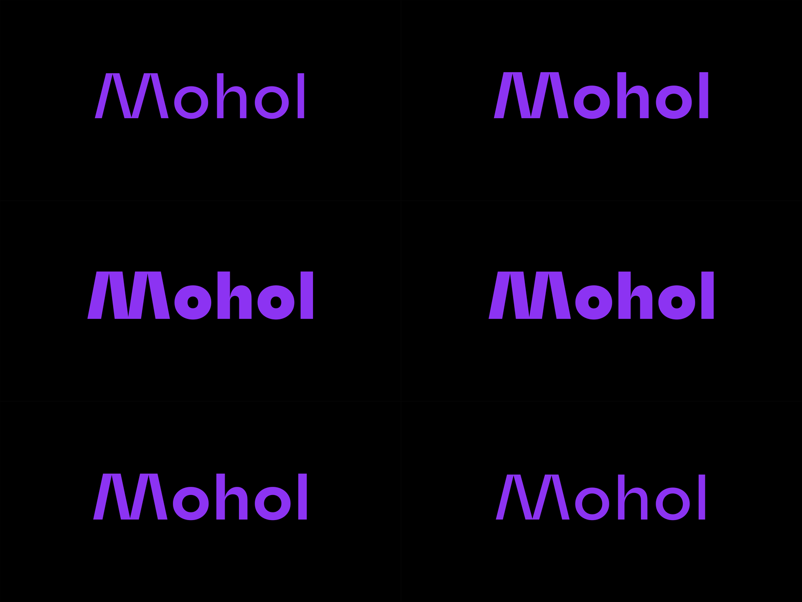
Mohol is an experimental high-contrast sans serif typeface designed by Adam Katyi, released at Hungarumlaut type foundry. The project started with Áron Jancsó's question: “What is the best way to design a sans serif, mono-linear typeface with an old classical tool, like a broad nib pen?”. I worked out a method, what you will find in the Design description section.
Mohol was originally designed for the László Moholy-Nagy Design Grant in 2016. The brief was to design a new typeface, in respect of László Moholy-Nagy’s work and heritage. He was the most famous Hungarian in the Bauhaus, painter, photographer. Moholy-Nagy was influenced by constructivism and a strong advocate of the integration of technology and industry into the arts.


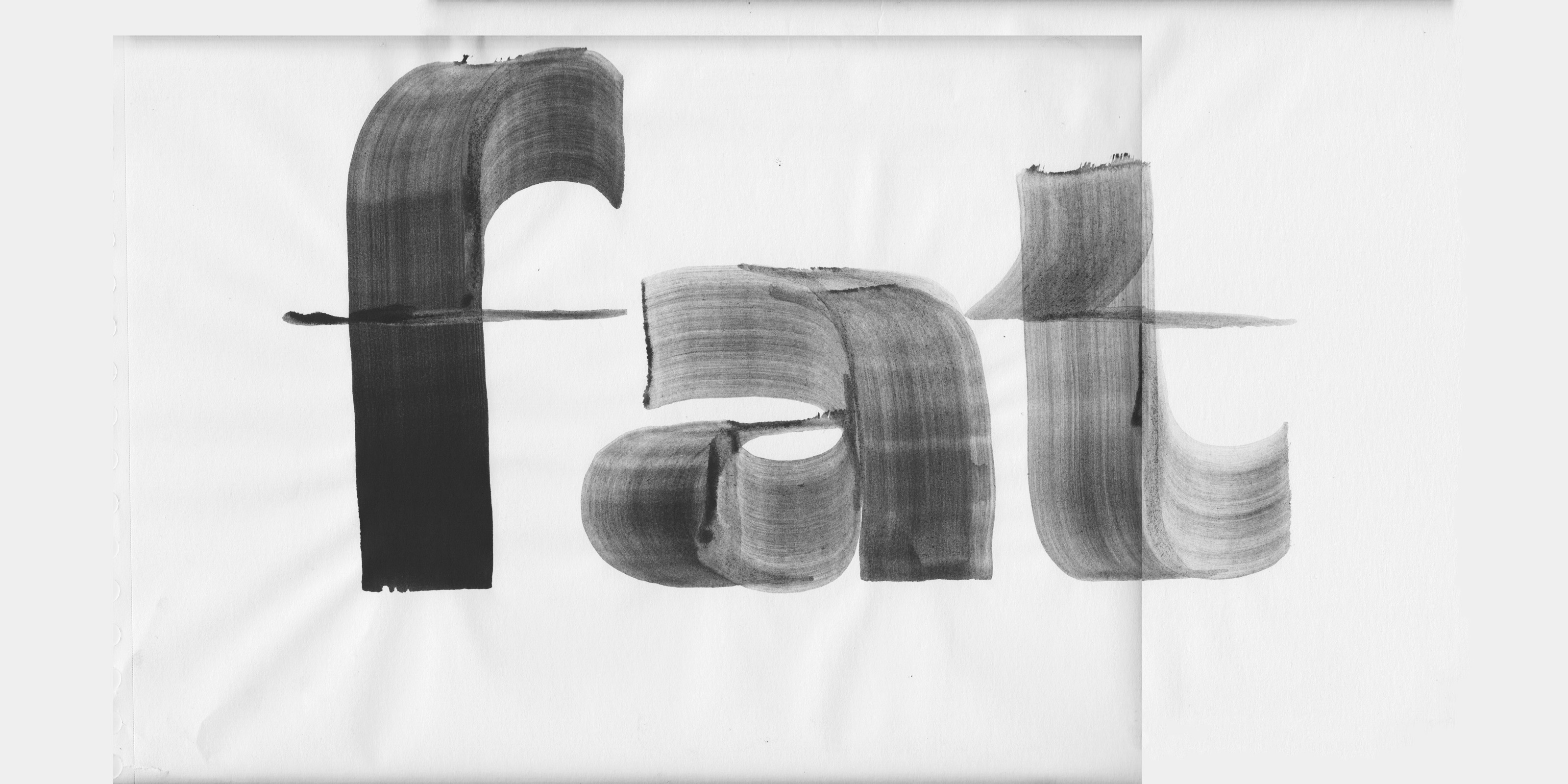
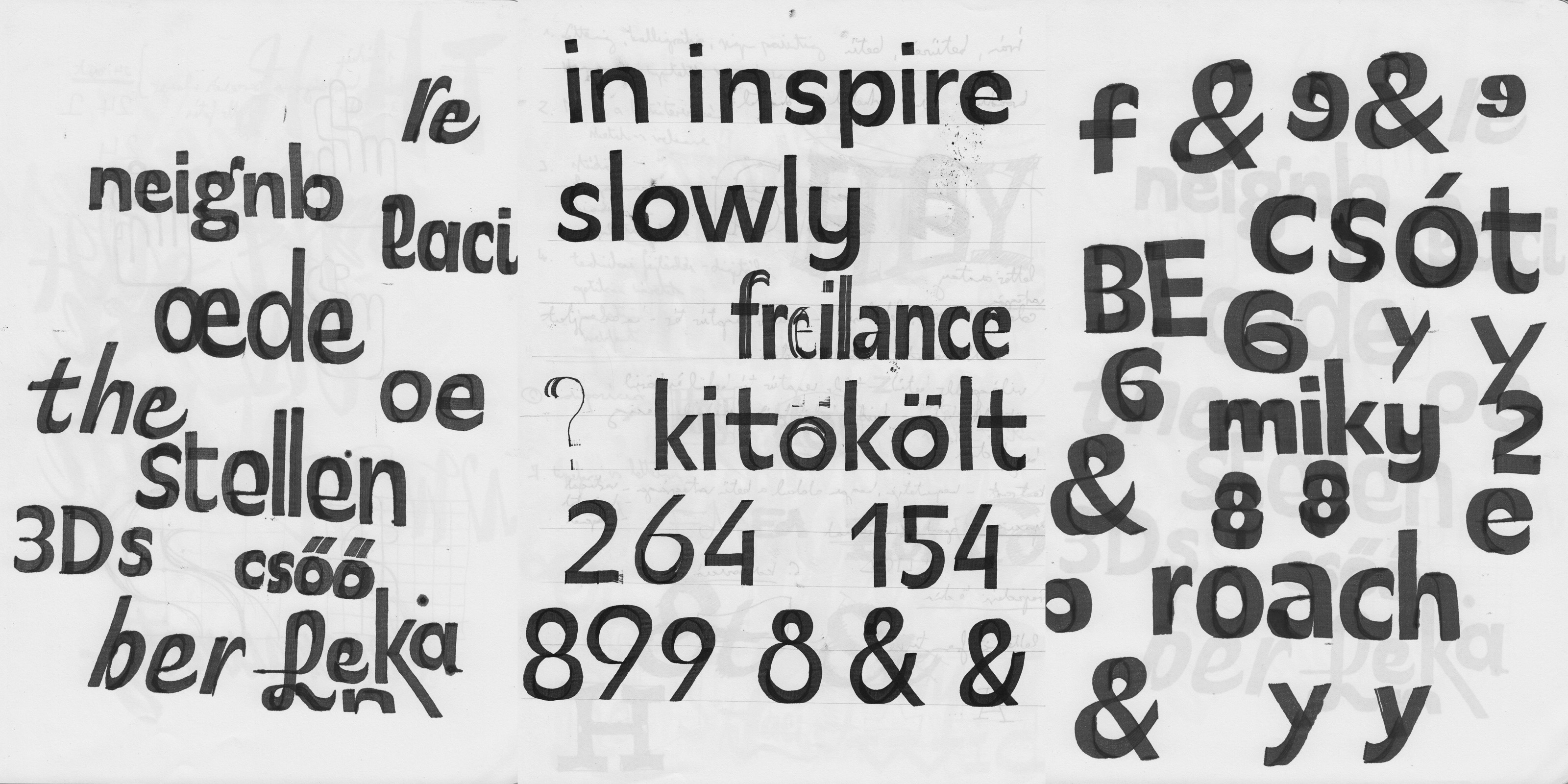
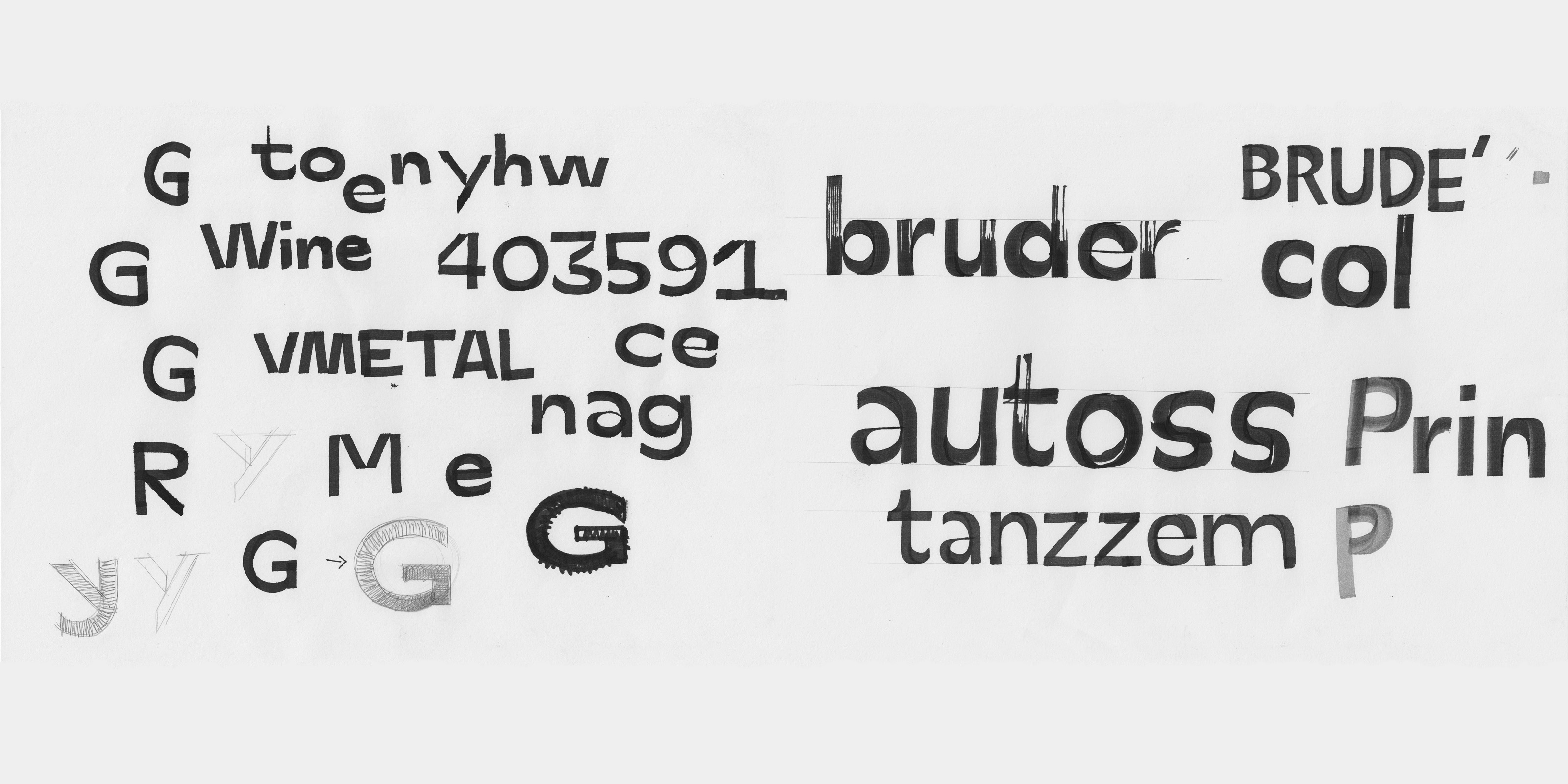
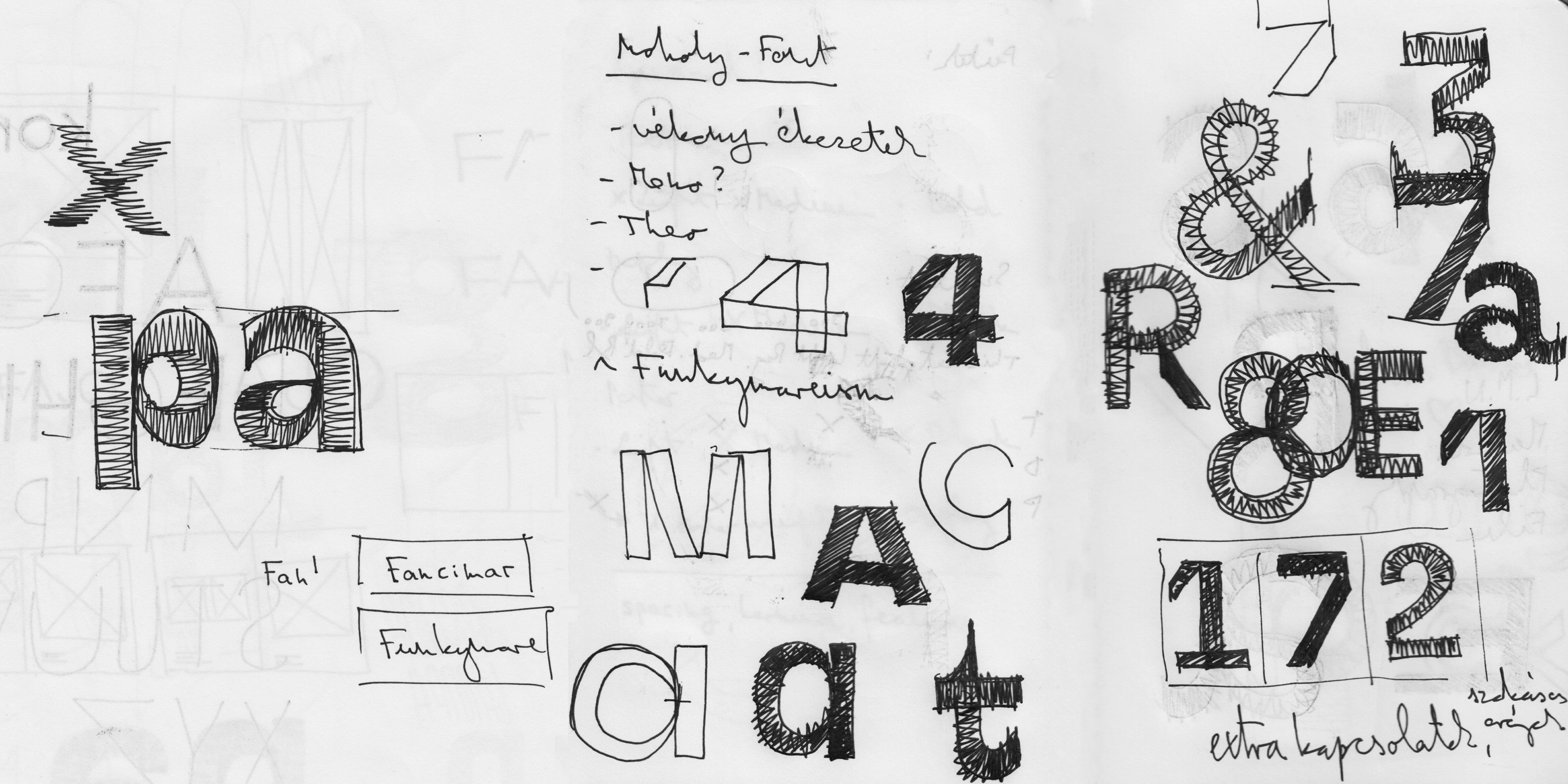
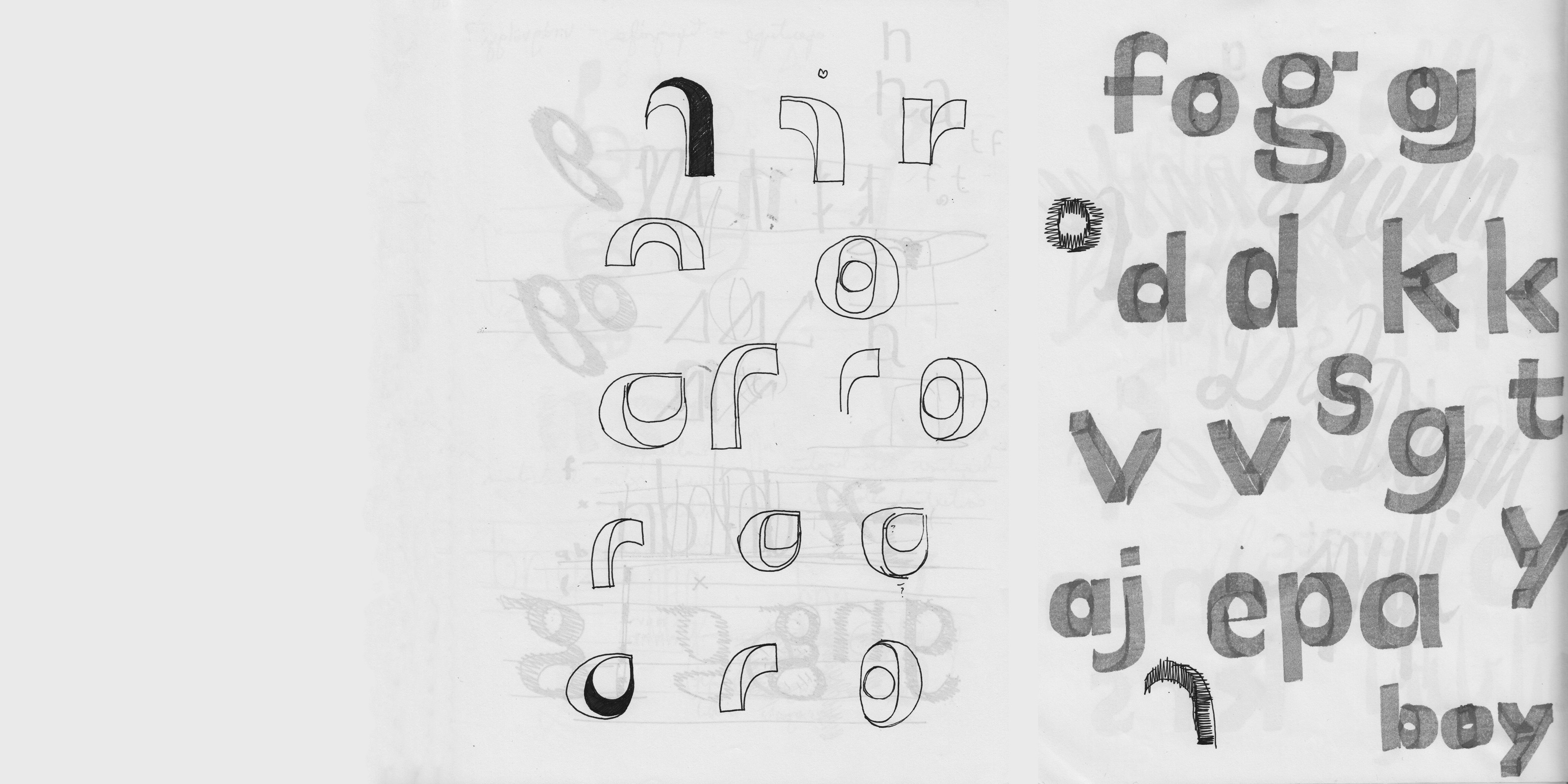
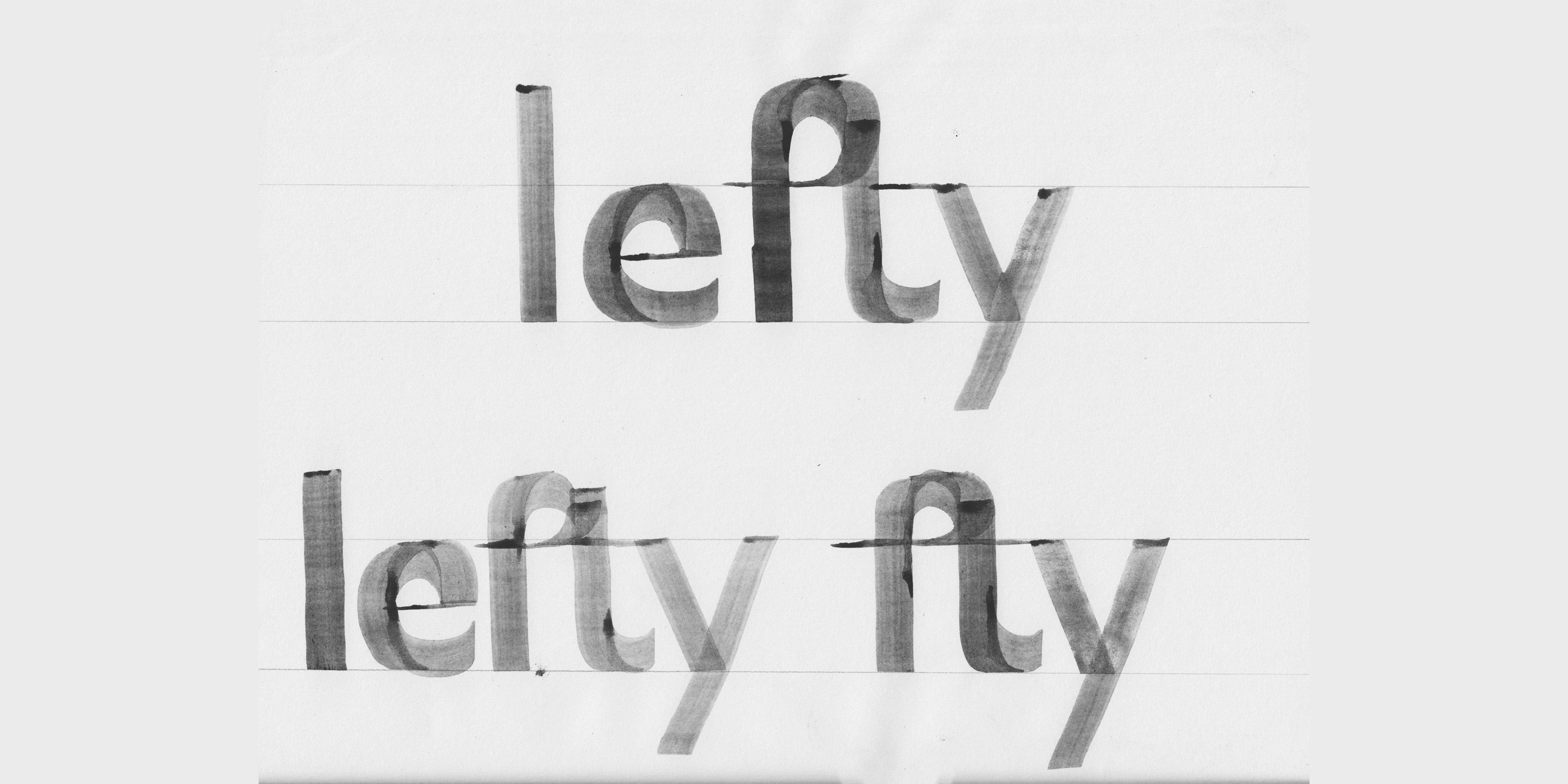
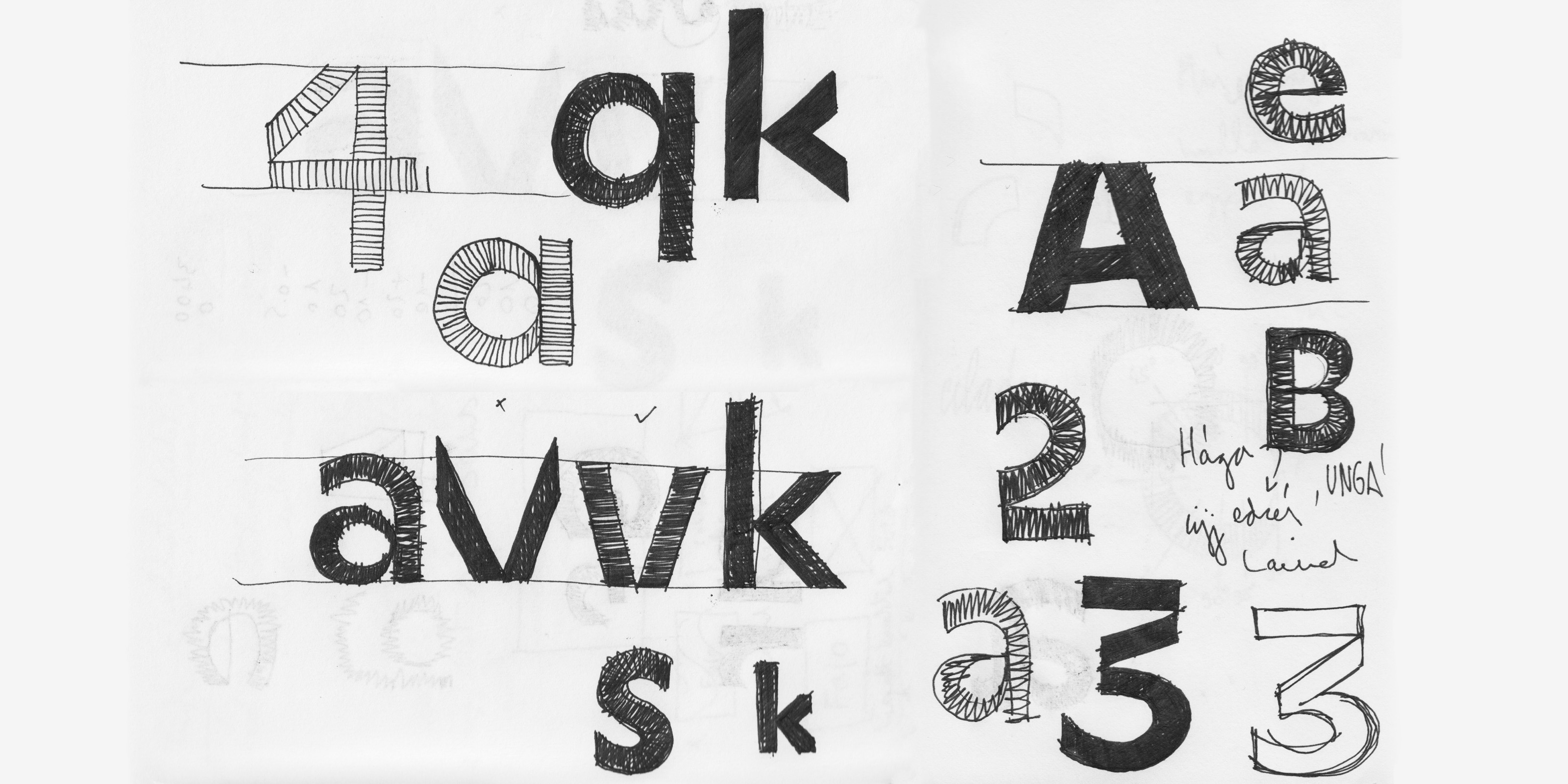
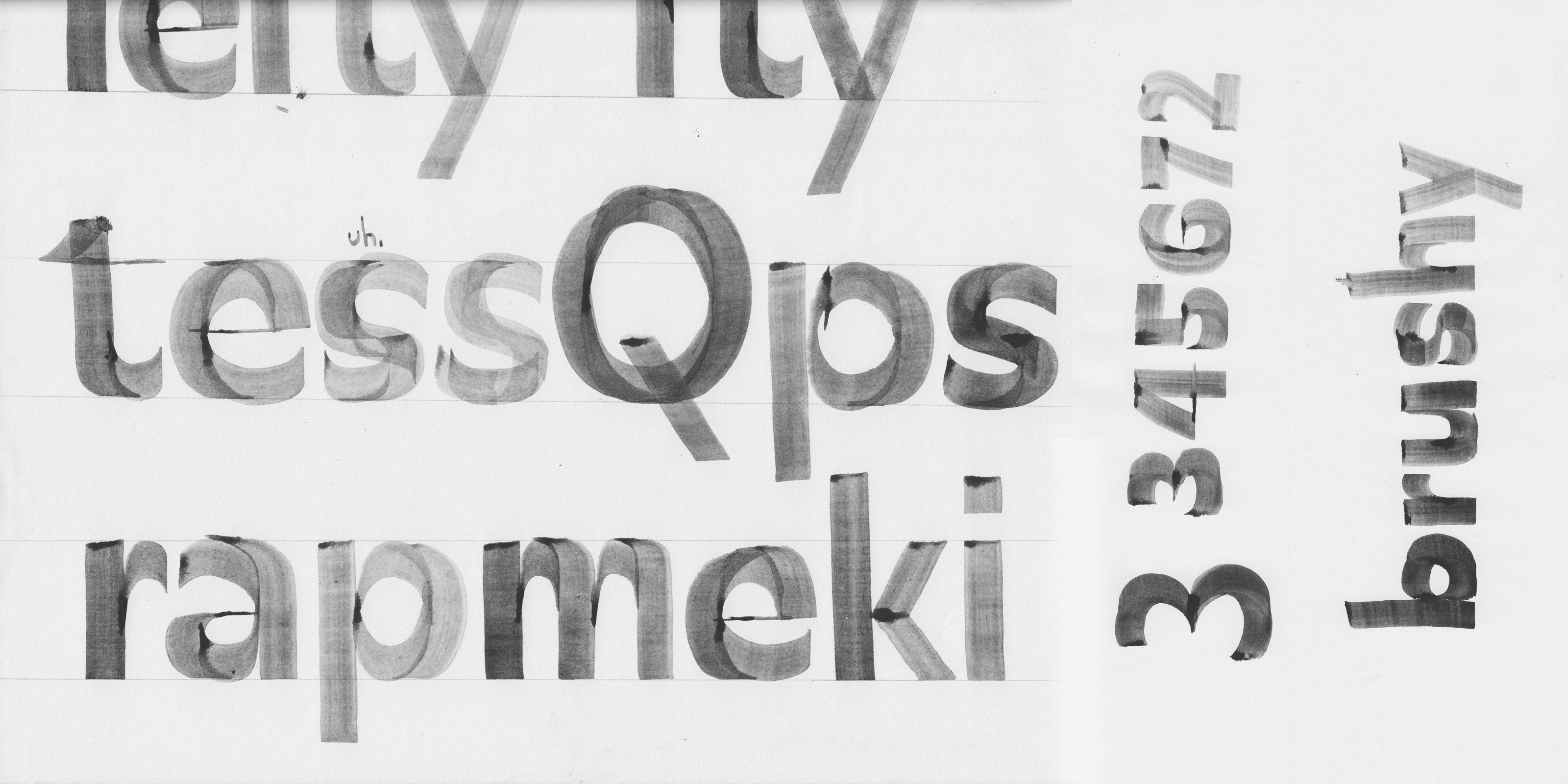
I started to experiment with my brushes and Pilot Parallel Pens. I wanted to draw sans-serif letters with similar horizontal and vertical strokes. I held the brush and the pen only vertical and only horizontal. A rounded shape is built up by two forms: a neoclassical construction (vertical axis) and a reversed contrast shape. These two create a mono-linear letter. (See the illustration below).
I drew all the characters with a flat brush and a pilot pen. With different pen-widths I could sketch the different weights of the typeface.


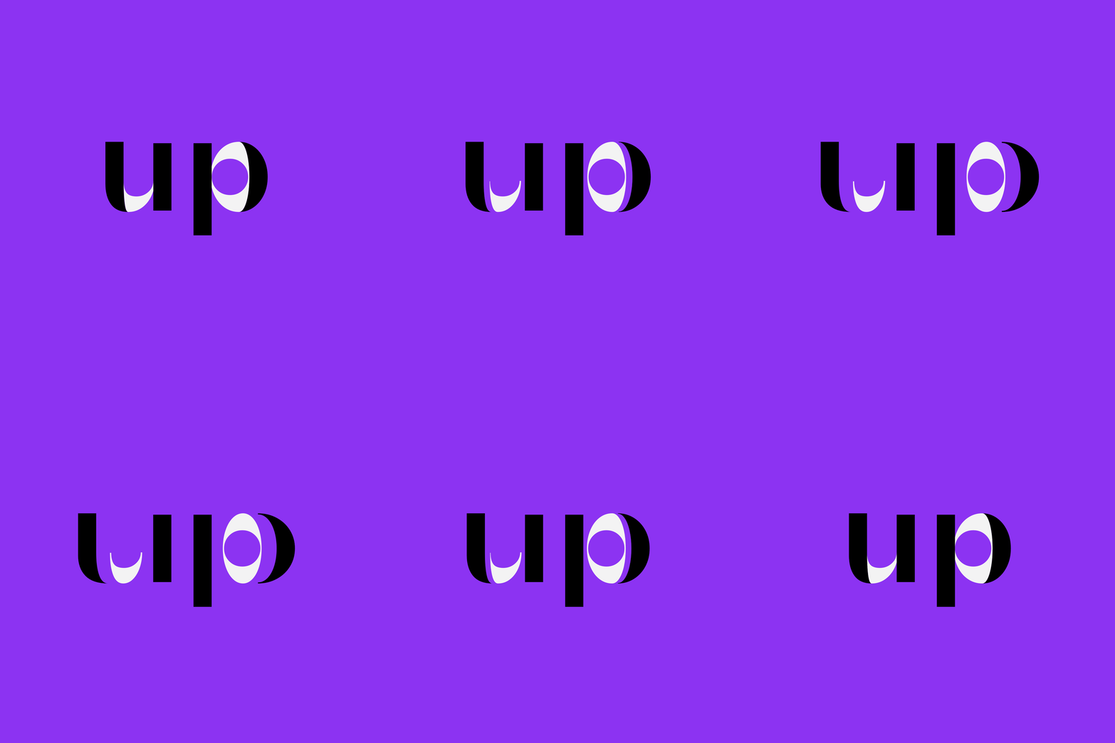


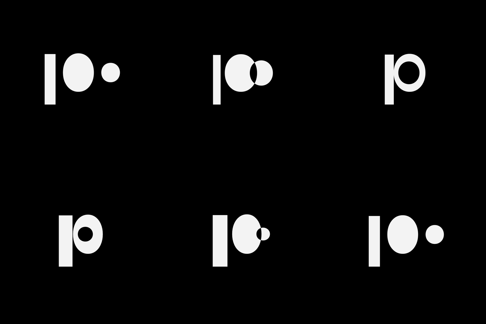

László Moholy-Nagy was one of the biggest artists in the Bauhaus. Continuing his spirit, I built up my letters from basic shapes, e.g. in the Regular style the lowercase «n» fits in an optical square, and the counter of the rounded shapes is a circle.
All letters have the same weight optically at the connections, it works between the different weights too. This high contrast appears only on those parts, where the punchcutters used inktraps, so in small size (~5pt) the shapes are still recognizable and the text is legible.


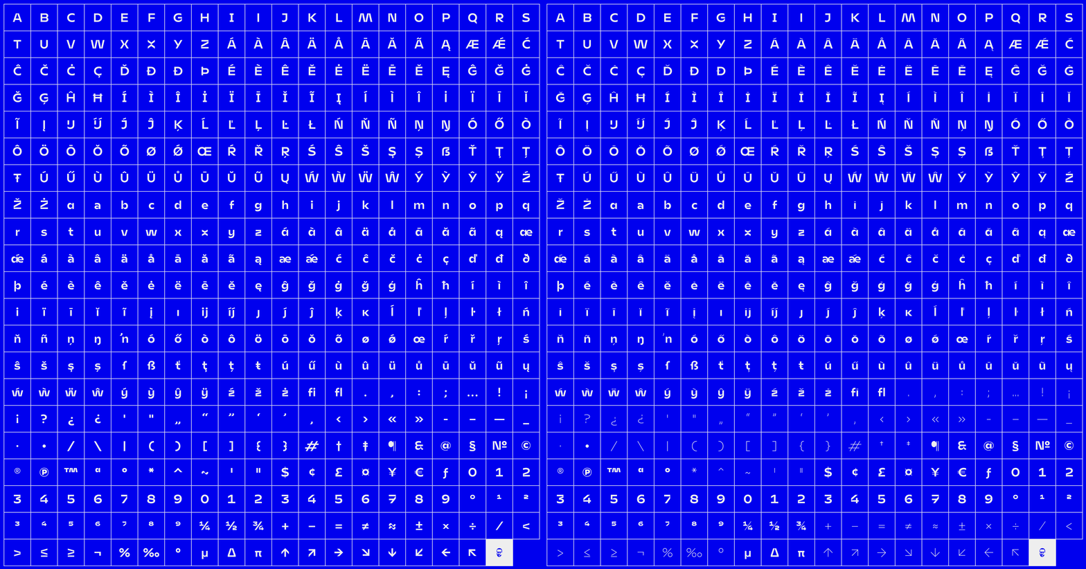
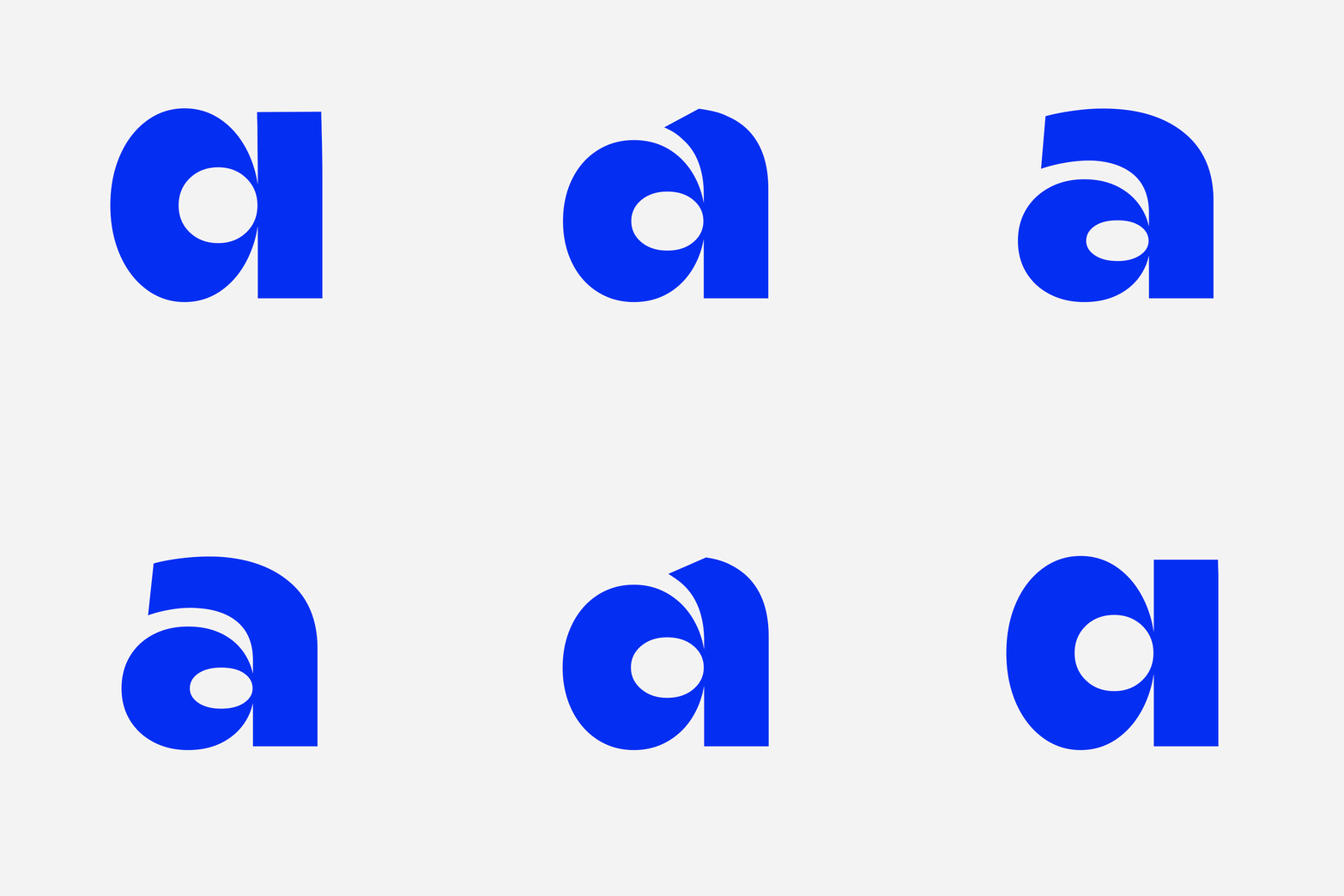
The typeface contains characters with thin accents and hairline punctuations for larger typesetting. There is an alternative double-storey version of the letter «a», a sans serif «I» and vertical «X, x» variations. Furthermore there are tabular numbers, case sensitive forms and arrows as discretionary ligatures.




Designed by Adam Katyi in 2016–2018.
All rights reserved ©
Available from Hungarumlaut type foundry
-
3D animation by Adam Miklosi
2D animations by Adam Katyi, made in Drawbot
based on Johannes Lang's codes.
